A founder's guide to building a sustainable brand
Your SaaS Product Has Evolved. Has Your Website?




One thing I keep noticing with early-stage SaaS companies is how quickly the product moves compared to the website. The first site usually gets built when a lot is still being figured out: the ICP is broad, the feature set is smaller, and the founder is still learning which part of the product people actually care about.
Then six months pass. The product gets better, sales calls get sharper, customers start using certain features more than expected, and the company begins to understand itself a little better. Meanwhile, the website is still telling the story from launch day. That gap is usually what founders are feeling when they say, “our website just doesn’t feel like us anymore.”
Where it starts
The product learns faster than the website
Early websites have a short shelf life because they are built with incomplete information. You may launch thinking one feature is the reason people will buy, then realise customers keep talking about another one. You may start by speaking to “teams” and later realise a much narrower group understands the value fastest.
Your sales conversations naturally change because you are learning. The way you explain the product gets clearer, the examples become more relevant, and certain objections start sounding familiar. Your website should benefit from that learning too. When it doesn’t, the founder ends up doing too much of the explaining manually.
These are the five signs I’d look for first.
Sales tells you
1. You explain the product better on sales calls than your homepage does
Listen to the way you describe the product to a good prospect. Pay attention to the examples you use, the feature you open first during a demo, and the sentence that suddenly makes someone go, “Okay, I get it.”
Then compare that with your homepage.
Founders naturally get better at explaining their SaaS product because they hear the same questions and objections repeatedly. You start learning which details need context, which benefits people care about immediately and which parts of the original pitch barely come up anymore.
The website often misses that learning. If your sales conversation makes the product easier to understand than your B2B SaaS website does, there is probably useful messaging trapped inside those calls.
What buyers notice
2. The feature people care about most is buried
Products accumulate capability quickly. Website hierarchy tends to stay close to whatever made sense when the site launched.
So a feature that now helps close deals can still be sitting halfway down a product page because it was secondary six months ago. Sometimes the strongest workflow barely appears on the homepage at all.
I’d look at the moments that get the strongest reaction in demos and compare them with what gets the most attention on the website. If those are very different, your SaaS website design may still be prioritising an older version of the product story.
The fix can be as simple as changing the information hierarchy, showing the product earlier or building the page around the workflow customers actually care about now.
Your ICP changed
3. Your ICP has become much clearer
Early-stage SaaS companies often start broad because they genuinely don’t know where demand will come from yet. “Teams,” “businesses” or “creators” can make sense when the company is still learning.
Then patterns start appearing. One job role understands the product faster. One industry feels the problem more often. One company size converts better. One use case keeps showing up in sales conversations.
Once the ICP gets clearer, the website has much more useful material to work with. The examples can become more specific, product screenshots can show recognisable workflows, and the page can answer the questions that particular buyer actually has.
That specificity matters for B2B SaaS website design because buyers are usually trying to work out very quickly whether the product was built for a company like theirs. A website that still speaks to everyone can make a much more focused product feel vague.
You have proof
4. You have much stronger proof now
The SaaS website you launched probably existed before your best customer, strongest testimonial or most useful product milestone. That means some of the strongest reasons to trust the company may have happened after the website was already finished.
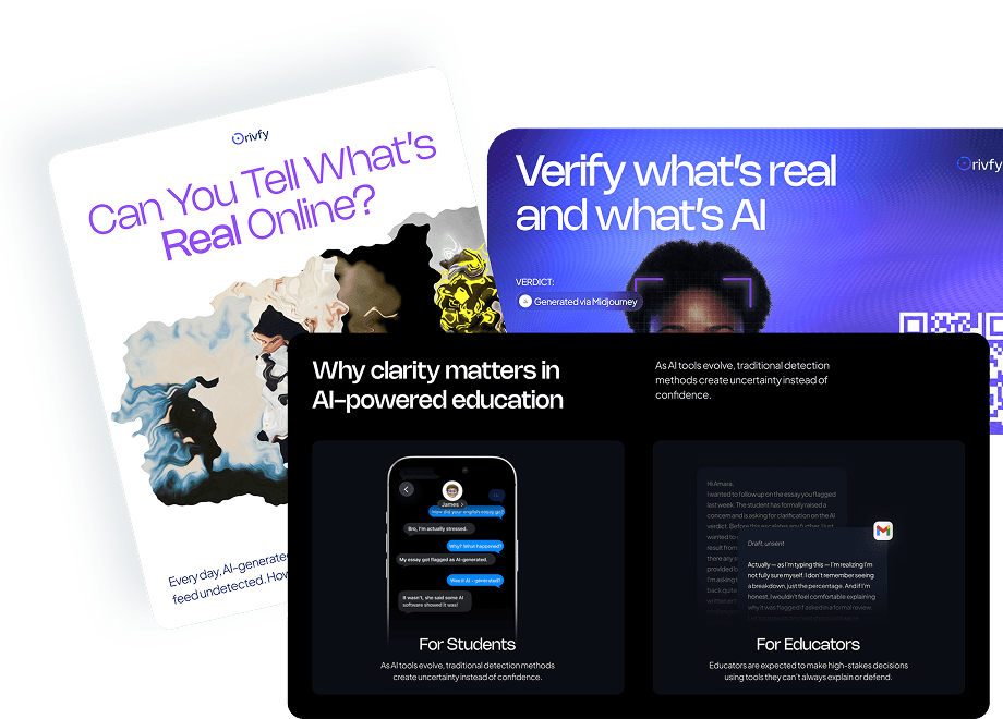
I saw this clearly while working on Orivfy. The challenge was making an AI verification product understandable and credible to someone encountering it for the first time. As the product grew, it eventually crossed 1,000 signups within 54 days. That kind of traction becomes useful website material because it gives the claims around the product something real to stand on.
VAVOOM had a different problem. The product combines vehicle recognition, AI upselling and POS integration for QSR businesses, so the website needed to make a fairly technical system understandable to restaurant operators and investors. We used the actual product flow and pilot proof in the story, including a 7% increase in average order value and 99% vehicle-recognition accuracy.
Those numbers help someone understand the commercial value of the product. If your strongest customer evidence, usage numbers or outcomes appeared after the website launched, your current site may be underselling the company you have today.
The brand feels behind
5. The product feels more mature than the website
Founders usually feel this one before they can explain it.
You open the product and it feels like the company you have spent the last year building. The workflows are more considered, the UI is stronger, customers are using it, and the team has a clearer understanding of where the product belongs in the market.
Then you open the website and something feels behind.
It may be the positioning, old product screenshots, a weak SaaS homepage, the information architecture or simply the way the company presents itself. That gap matters because the website is often where a potential customer decides whether the product deserves more of their time.
A mature product with an early-stage website can create unnecessary doubt before someone ever sees what you built.
A simple way I’d check this is to open your homepage, open the product, then say the pitch you currently use with prospects.
Do those three things describe the same company? Do they prioritise the same customer problem? Do they show the same product strengths? Does the proof on the website reflect what you know today?
If they are fairly aligned, you may only need targeted improvements. If they feel like three different stages of the business, there is probably a deeper clarity problem worth addressing before touching the visual design.
I built the B2B SaaS Clarity Check for exactly this kind of situation. It takes about five minutes and helps identify where a SaaS product or website is becoming harder to understand, trust or choose. Running through that first gives you a clearer idea of what actually needs attention before committing to a larger SaaS website redesign.
The takeaway
Your SaaS website should keep up with what the business learns
SaaS website carries a live version of the company’s story. That story changes as you learn more about the product and the people buying it. The ICP gets sharper. The strongest workflow becomes clearer. Better proof appears. The sales pitch improves. The product itself becomes more mature. Every so often, the website needs to absorb those changes too. For me, that is the useful way to think about a B2B SaaS website redesign. You have learned enough about the business that the version of the story you launched with no longer represents the company properly. When that happens, the website has something new to say. Most of the material is already sitting inside the product, your customers and the conversations you are having every week.
LightWork AI
Product, Brand, Website, GTM

Orivfy
Product, Brand, Website, GTM