
Overview
Scope
What I brought to the table.
Website Design
Year&Role
How long I helped move the ship
Website Designer - 2026

The Problem
The existing website made it difficult for prospective students to quickly understand what FairChild offered, why the programs were different, and where they should go next.
Navigation and hierarchy needed work, key information felt fragmented, and the overall experience did not yet support the premium positioning the team wanted.
That mattered because the website had to do more than present programs. It needed to help visitors compare options, see proof, build confidence in the institute, and move naturally toward the application flow.
The existing website made it difficult for prospective students to quickly understand what FairChild offered, why the programs were different, and where they should go next.
Navigation and hierarchy needed work, key information felt fragmented, and the overall experience did not yet support the premium positioning the team wanted.
That mattered because the website had to do more than present programs. It needed to help visitors compare options, see proof, build confidence in the institute, and move naturally toward the application flow.

The Solution
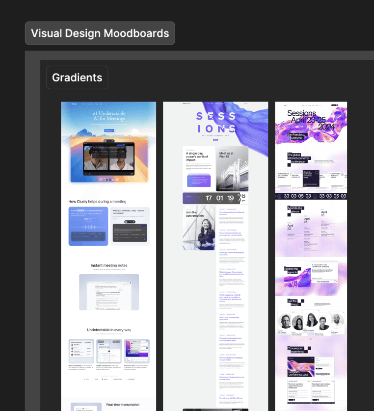
I started by looking at how the website could communicate FairChild's value more clearly from the first screen. I reviewed the existing direction, studied competitors in the education space, and pulled useful interaction and presentation references from products like Stripe and Cluely. I explored around four to five landing page directions before settling on the final approach. That process helped me work through different ways of presenting the programs, proof, career support, and brand personality before committing to one system.
I started by looking at how the website could communicate FairChild's value more clearly from the first screen. I reviewed the existing direction, studied competitors in the education space, and pulled useful interaction and presentation references from products like Stripe and Cluely. I explored around four to five landing page directions before settling on the final approach. That process helped me work through different ways of presenting the programs, proof, career support, and brand personality before committing to one system.

The Solution II
Once the direction was clear, I used Figma Make to turn the landing page into a working prototype. That gave the team something closer to the final experience to review and made it easier to communicate the intended interactions to development. I also built reusable components for sections such as Interview Mastery Prep and worked through the responsive behaviour so the same experience held together across screen sizes. The final page structure was built around the journey FairChild wanted visitors to take: understand the promise, see the programs, build trust through support and proof, then move toward applying.
Once the direction was clear, I used Figma Make to turn the landing page into a working prototype. That gave the team something closer to the final experience to review and made it easier to communicate the intended interactions to development. I also built reusable components for sections such as Interview Mastery Prep and worked through the responsive behaviour so the same experience held together across screen sizes. The final page structure was built around the journey FairChild wanted visitors to take: understand the promise, see the programs, build trust through support and proof, then move toward applying.


The Solution III
I created interactions in Jitter for the FairChild logo and the “You bring 100%, we support 200%” idea, then brought those into the Figma Make prototype so the team could see how they would behave in context. I also documented the website structure, content decisions, delivered assets, open questions, and handoff notes in Notion. That gave design and development one shared reference and made the implementation review much easier to manage.
I created interactions in Jitter for the FairChild logo and the “You bring 100%, we support 200%” idea, then brought those into the Figma Make prototype so the team could see how they would behave in context. I also documented the website structure, content decisions, delivered assets, open questions, and handoff notes in Notion. That gave design and development one shared reference and made the implementation review much easier to manage.



The Result
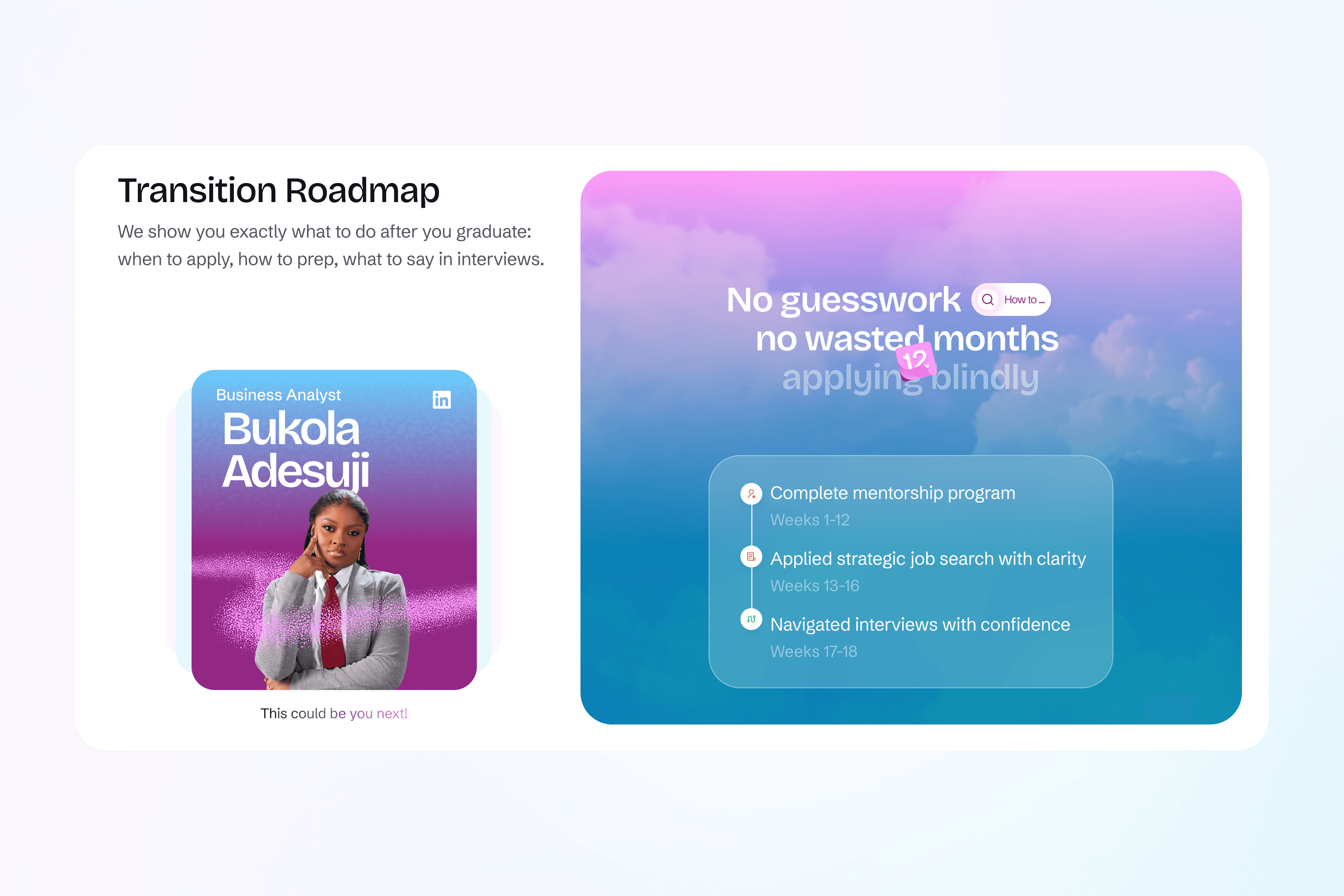
The final direction gave FairChild a clearer and more structured way to present its programs, career support and outcomes. Prospective students can understand what the institute offers, compare their options and move towards applying without having to piece the information together. The work also gave the team a responsive set of reusable components, a working Figma Make prototype and documented handoff notes that made review and implementation easier. The founders were happy with both the final website direction and the process behind it, giving FairChild a stronger foundation it can continue building on as the platform grows.
The final direction gave FairChild a clearer and more structured way to present its programs, career support and outcomes. Prospective students can understand what the institute offers, compare their options and move towards applying without having to piece the information together. The work also gave the team a responsive set of reusable components, a working Figma Make prototype and documented handoff notes that made review and implementation easier. The founders were happy with both the final website direction and the process behind it, giving FairChild a stronger foundation it can continue building on as the platform grows.

If you’re building something and want a clear path forward, let’s talk.
If you’re building something and want a clear path forward, let’s talk.